CSS animation is a good way to quickly animate your web pages and add some nice visual interest. Here in part one of our animation series we will show you a very simple animation using only CSS that will give you a few of the basic concepts to hopefully get you inspired to learn more.
What Makes up a CSS Animation?
For CSS animation to work we need to define Animation Properties and Keyframes. Animation Properties are added to the CSS element (likely your class), while @keyframes are built outside of the class and then assigned to it using the animation-name property (see example below).
Keyframes: Where the Action Happens
Keyframes contain the following property values.
- animation-name The name you use to add the animation to your class
- keyframes-selector Percentage of the animation duration. The legal values are –
0-100%
from (same as 0%)
to (same as 100%) - CSS-styles CSS classes to change the element during animation.
Here is a simple example of some keyframes. The animation will simply move from the top position based on the pixel amount we choose.
Animation Properties: Hold on animation, we have rules.
Our animation properties will let us define what animation to use and how it gets animated. There are many properties, but you only need two to create a simple animation.
- animation-name What animation do we want to use (remember we assign this name in our @keyframes)
- animation-duration How long should the animation be? The options can be in Seconds (e.g., 2s) or Milliseconds (e.g., 200ms)
There are a few more useful ones to know such as –
- animation-iteration-count This controls how many times the animation runs, default is 1, you can use “infinite” to have your animation run forever (maybe not FOREVER…but as long as the page is loaded).
- transform-origin This one is important as it sets the initial location of your animation. If you want it in the center use this setting transform-origin: 50% 50%;
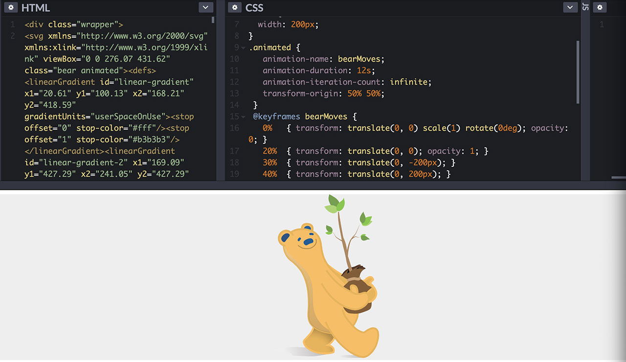
Let’s make our favorite bear dance.
Here is a quick Codepen to demonstrate a simple animation. This demonstrates how easy it is to create web animation with only CSS, no JavaScript required! I have wrapped the animation in a <div> with the overflow set to hidden (otherwise you would see the bear outside of the container). Here we are using the Transition and Opacity CSS properties in our @keyframes to move our bear around and fade him in and out. Also note the use of transform-origin: 50% 50%; so our Bear is centered to begin with.
In part two we will show how to trigger an animation when it is scrolled into view on the page.

